How to Create a Color Scheme, Part Two
7. Once you have done this you then know what you have to select – so get to it.
Use your inspirational piece or your client’s suggestion as a starting point for putting things together.
8. Select samples of paint, carpet, wall vinyl, fabric, trims, artwork and lay them all out together. This now becomes a process of elimination, this works with that, that does not out it goes, you need a darker color here, some texture and pattern there etc.
Go with your instinct. I cannot stress that enough. (I generally find that the color or item that I picked first is usually the one I end up selecting after trying and eliminating numerous other choices.)
9. Have a look at the samples in the new environment, checking that they work with the current light, because as we know, this is how we read color and what looks great in our office may not do the same in the space we are designing.
Some things to remember when choosing finishes:
Try and get large pieces of the samples, if you use small swatches it is difficult to get a good picture of the scale of the pattern or color in the interior scheme.
Remember that when the paint is on the wall it will appear much darker than the small paint chip in your hand.
Consider how grouping, gathering and hanging curtains at the window will look with patterned fabric, it is usually more intense that a flat piece of fabric.
Keep the scale of designs and patterns in proportion, a tiny motif upholstery fabric can look lost on a large chair or couch.
If using more than one pattern in a room make sure there is something that brings them all together, a texture, color, or design emblem.
When viewing your samples, remember that you will be seeing them on different planes, so place the carpet on the floor, hold up the drapery fabric beside the window, and place the paint sample vertically. Your design when complete will be 3 Dimensional, so get used to thinking that way.
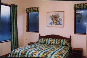
A simple chant to keep in the back of your mind when deciding on what colors to use is “that cool colors recede and warm colors advance”, and dark colors appear heavy and enclosing, whilst light colors make the space feel larger and lighter”.
By selecting a dark flooring you ground your color scheme, the opposite with a light flooring, it appears to float..
If you decide to use a monochromatic color scheme,make sure that you include items of texture to give the room some body, otherwise it will appear flat and boring.
It is visually important to keep balance in a room, therefore never group a color or pattern in one area only, distribute it around the room in varying proportions.
The most common way to use color in a room is by having one a dominant color for the main area and accent the other coordinating colors around the room.
When you use accent colors or patterns ensure that you use them more than once so they harmonize with the room.
If you want to work with a themed room, do your homework and research the period. Then make sure that the fabrics, wallpapers, fabrics, furniture, lights etc are available so that your theme can be successful.
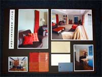
10. Collate all your finishes and colors – type up your finishes schedule – assemble a color board and present the ideas to the client.
The color board should provide examples of paint colors, fabric swatches, tiles, timber veneers, pre finished boards, any items that you will be proposing to use. If you cannot get samples or the items are too large, such as furniture and light fittings, then take photographs and use these.
Always group the finishes that will be seen together. Start at the bottom with the flooring and move upwards to the ceiling, so that you can get an idea of the way the finishes and colors will look when complete.
Don’t forget to put your contact information, the name of the project and cross reference the board to your schedule either with numbers or written labels. Make it crystal clear what you are proposing. If you have multiple rooms that are complex, then use one board per room.
Here is our example of your finishes schedule for the one room
Item / Area |
Existing Substrate |
New Finish |
New Color |
| Entrance | |||
| Ceiling | Plasterboard | Semi Gloss Paint Finish | Dulux White |
| Cornice | Plaster | Semi Gloss Paint Finish | Dulux White |
| Walls – General | Plasterboard | Acrylic Low Sheen Paint Finish | Dulux Gold |
| Dado Rail | Timber | Stained and Varnished | Sand back and apply 3 coats clear polyurethane finish |
| Below Dado Rail | Pressed Metal Sheet | Lacquer paint | Dulux Blue |
| Skirting | Timber | Stained and Varnished | Sand back and apply 3 coats clear polyurethane finish |
| Floor | Carpet (Timber Floor Boards Under) | remove carpet and underlay | Sand back timber floor boards and apply 3 coats clear polyurethane finish |
| Features – Ceiling Rose | Plaster Painted | Semi Gloss Paint Finish | Dulux White |
| Pendant Light Fitting | Brass and Glass | remove and replace with frosted glass pendant no 12345 | |
| Turkish Rug | Wool | Blue and Red Tones | To remain |
11. There are often minor alterations to be done at this stage to touch up the scheme, a slight color or texture change, the addition or subtraction of decorative elements etc.
12. Make the adjustments to your schedule and date it and voila! You have now completed a color scheme. Don’t forget to make sure your client signs off the proposed scheme and any changes that get made along the way, so that you don’t have any confusion at the end. Happy decorating!
Find More Knowledge on Color
Popular Color Schemes
Free Color Course
Color Articles
Color Information
Color Meanings
Color Schemes
Color Theory
Paint