What is Color Contrast?
There are many different ways of defining contrast.
The dictionary defines it as the juxtaposition of dissimilar elements e.g. color, tone, or emotion in a work of art, degree of difference between the lightest and darkest parts of a painting, photograph, television picture etc.
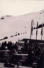
Picture – The detail in this black and white photograph is difficult to read, as the mass of people appears gray. We only see dark gray and white and the result is a very flat and uninteresting photograph.
Comparison of similar objects to set of their dissimilar qualities, a person or thing against which another may be contrasted. To compare two things in respect to differences.
The designer wanted to highlight the intricate cabinetry in this kitchen choosing a dark charcoal for the walls, and floor to contrast with the cream on the cabinets making them the dominant feature in the kitchen.Reviewing good black and white photographs is an ideal way to recognize contrast. The tonal contrasts portray the detail. In comparison, looking at a bad example of a black and white photograph will tend to look gray and flat, as the range of contrast is less.
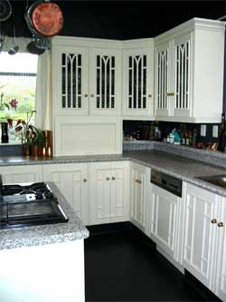
Picture – The designer wanted to highlight the intricate cabinetry in this kitchen choosing a dark charcoal for the walls, and floor to contrast with the cream on the cabinets making them the dominant feature in the kitchen.
These forms of contrast are called achromatic – the contrast between black and white and their respective mixtures produced – gray. As we know from reviewing our photographs, the greater the tonal contrast, the more effective and dramatic the finished article appears.
We see many contrasts around us in nature every day, a white sheep against the green grassy paddock, a luminous orange buoy bobbing about on the blue green sea, a black jagged rock jutting out of a snow covered hill.
These are contrasts in color and tone as we have learnt, as well as pattern and texture.
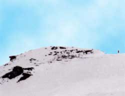
Picture – The rugged contrast between black rocks and pure white snow.
A smooth stone paver set into a green lawn, a brick wall with ivy growing up and over it.
If two objects have a similar texture and pattern and are seen in close proximity, it can be very difficult to distinguish one from another, as they appear to blend into the environment, therefore no contrast. This can be very useful in Interior Design if we want to camouflage something that is not pleasing to us.
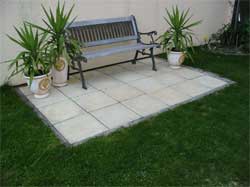
Picture– Concrete pavers contrasting with green grass lawn to create a defined separate seating area.
For example, by painting existing brown timber cupboard doors over a bench, the same light color as the walls – they go from being a large imposing storage space to disappearing back into the wall giving the illusion of space and removing all traces of contrast. Therefore contrast is a very useful tool in design and one to be embraced.
Find More Knowledge on Color
Popular Color Schemes
Free Color Course
Color Articles
Color Information
Color Meanings
Color Schemes
Color Theory
Paint