Understanding Color Balance
No matter what your color preferences are, bold or subtle, color balance is the most important secret in achieving your desired interior designed effect. It is also the most difficult to describe as it comes down to how your eye perceives the space around you.
It is heavy and enclosing, especially at night creating an imposing atmosphere, but the large windows mean vast amounts of natural light can enter during the day and the light reflects off the white walls and provides a perfect backdrop for the antiques and collectibles in the room, removing the focus from the fabric.
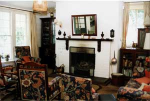
Picture –The large patterned fabric upholstery becomes a focus of this room.
We have learnt from pattern and texture about scale and proportion; these are major factors in balance. What we are ideally trying to create is a harmonious space and this is achieved because we feel comfortable, why do we feel comfortable?
Because we can enter the space and not feel over or under whelmed by what we see.
For example heavy floral patterns over everything in the same color feels oppressive, or the entire room being painted white with all white accessories and we feel like we we are in a hospital surgery room and frightened.
We can enter another room and see that some one has used a warm two tone gold subtle striped wallpaper, a patterned red and gold fabric for the drapes, a different color way, green and gold.
The scale of the pattern on the sofa, the gold and red colors are also depicted in a painting over the fireplace and the carpet is soft warm and inviting shade of red.
They have thought about the colors and how they are to be seen as a whole.
By selecting two or three colors and distributing them around the room in different weights they seem to flow through the room.
A one off color will stand out and be the centre of attention, as it does not relate to anything else in the room.
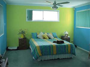
Picture – A room with equal amounts of three different colors to the walls is not pleasing to the eye. There is no sense of balance. The left wall is very heavy and enclosing, dominating the space, it does not tie in with any of the other décor.
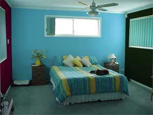
Picture – This room is balanced as only two colors have been used on the walls, one being used more and is therefore dominant, the pale blue. The yellow acts as a feature behind the bed and accentuates the yellow in the bedspread.
If you imagine a room with four walls, if you then painted each wall a different color, there would be no balance. If you painted two opposing walls the same color you have created a balance, or even one wall a different color to the others.
But the first example doesn’t let your eyes rest, and makes you feel uneasy, it does not create a pleasing balance.
It has been used as a throw on the bed, the cover of a chest at the foot of the bed, and as upholstery on the Morris chair.
Pillows in matching colors compliment the scheme.
The pattern has been dispersed around the room to balance such a bold design.
The navy blue has been selected as fabric for the blinds to further balance the weight of the colors.
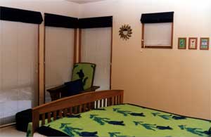
Picture – The room is large enough to carry a large pattern.
Remember that once you have selected the colors and fabrics and have them all in your space you can move them around to get the balance correct.
The placement of the chairs in this symmetrical space creates a focal point without distracting from the view beyond.
A good way to practice balancing a room is by using an existing space, moving the furniture around, putting new accessories in and observing how the space feels.
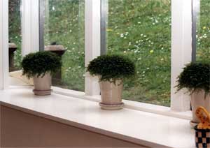
Picture – The houseplants in pots placed on the box windowsill provide pattern and a sense of rhythm; this is achieved by using identical pots and plants and spacing them evenly between the window mullions.
The look is balanced and pleasing to the eye.
The chairs are made of timber slats, meaning the light can still filter through them. Try it again using different colors and accessories, does it change the mood, do you feel more relaxed?
These skills come from practice, practice and more practice.
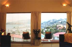
Picture – The placement of the chairs in this symmetrical space creates a focal point without distracting from the view beyond.
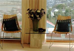
Picture – A close up of the chairs shows that they are made of timber slats, meaning the light can still filter through them.
The blue cushions add to the symmetrical balance, and the blue flowers on the table complete a triangle grouping of color in this otherwise monochromatic schemed room.
Another way to sharpen these skills is to critique magazine photographs of spaces. Select a picture and note down if they look balanced, why does the space work, is there anything you would add?
Try it when visiting people, do it mentally of course, don’t tell them they need to move their sofa and reupholster their chair, or you could lose friends fast.
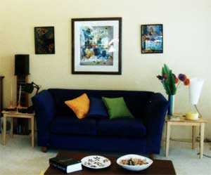
Picture – You can experiment with a room like this, bright cushions in orange lime and cobalt, an orange floor rug and matching vibrant pictures on the wall.
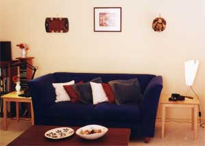
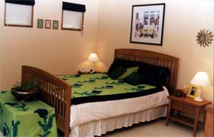
Picture – The same room – blue, burgundy and cream have been used to accessorize and create a more soft subtle feeling
Find More Knowledge on Color
Popular Color Schemes
Free Color Course
Color Articles
Color Information
Color Meanings
Color Schemes
Color Theory
Paint