Color Tips and Helpful Hints
When selecting colors from small paint chips or swatches, remember that they will look considerably darker when they have been painted on all the walls.
You can add sparkle and a new dimension to your walls by using metallic paints. To make them really stand out from a crowd add halogen lighting and watch your walls sparkle.
For selecting colors when you are dividing areas of a wall, use the darkest color to the bottom, this will help ground the scheme and not leave it floating. It is also more pleasing on the eye. This works well if you are using a chair rail, paint the darker color below this.
Interior Design Color Tips
Use accent colors more than once in a room to create harmony and balance, if you want to use a stand alone color, then make this a focal point.
Color schemes work best when you use one dominant color as the main theme and scatter accent colors around the room to add detail, pattern and texture.
To ground a scheme select a dark flooring, the opposite works for making a space float or feel open, select a very light floor.
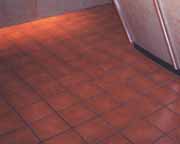
Select a dark flooring to ground a scheme
A monochromatic scheme is the easiest type of scheme to create, but can fail miserably if you do not add texture and pattern into it. It will appear flat and boring. Think in three dimensions of one color.
To ensure balance in a room, don’t group your color or pattern in one area, make sure it is evenly spread around the room, this makes it comfortable for your eye and creates a harmonious feel.
One of the first things to remember when selecting colors is that cool colors recede and warm colors advance and that dark colors look heavy and enclosing, light colors make the room look larger and lighter, this will get you a simple way to rule out colors and concentrate on the colors that will work in the space.
Color selection for rooms that receive a lot of natural sunlight should be from the cool colors and vise versa, rooms that receive little or no natural sunlight should select colors from the warm color rage.
The amazing thing about technology is that we can now color match anything. Simply take a sample of the item you want to match to your paint store and they can analyse it. They can then work out a formula to recreate it in a paint color especially for you.
Scale is important to remember when you are selecting, a deep strong color can look great in a small piece, but all over the walls can be intimidating.
Select from your samples as you would see them finished. For example lay the carpet sample on the floor, hang up the fabric at the window, and have the paint or wallpaper vertically against the wall. It is important to visualize these in 3d and in the correct light.
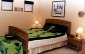
Patterns give a room personality. Ensure that they are not solo artists. Unless you are going to make a feature or focal point, then use patterns more than once in a room. If you want to use more than one pattern in a space, ensure that there is an element that brings them together, for example a color, design, emblem, or motif.
Looking for more interior decorating tips and information, then you should be able to find it here at color.interiordezine.com If you want to learn about color then please enrol in our free color ecourse and be guided through how to decorate and use it like a professional.
Written by Lee Brown