Visual Choices in Curtain Selection – Pattern and Texture
Pattern and Texture
This term usually creates the image in your mind of large bold 1960’s patterns. It does encompass these but it can also be as simple as a small contrasting colored dot on a fabric.
There are so many patterns that we will keep it simple.
The important thing to remember when purchasing a patterned fabric is that there will probably be a pattern repeat, this means that you will require more fabric as a pair of curtains need to have the same continuous pattern each side. (Pattern repeat – the length of fabric before the pattern repeats itself).
Patterns can be fun with curtains! So don’t be afraid of selecting a pattern for your curtains.
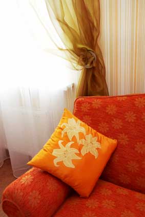
Pattern and texture combines to work well here, a small motif on the sofa, a larger one on the cushion and a subtle stripe for the wallpaper. A soft and gentle continuation of color and a new silky texture of curtain add a softer feel to the heaviness of the bold orange sofa and cushion.
Take children’s rooms for example, there are so many different patterned fabrics available in different themes that it would be a shame to deprive your child of the fun they will have looking at them.
Children’s rooms can tolerate more patterns than adults for example.
Children tend to play in their rooms and are very active – they sleep because their bodies tell them that they are worn out.
Adults generally work all day and want to be able to enter their bedroom unwind, relax and sleep without being stimulated and distracted by intense color or bold and busy patterns.
There are many pattern designs today that have co-ordinates that you can mix and match, fabrics, borders, sheers, wallpapers, borders even bedding linen. This is a simple, can’t go wrong way to use pattern as a designer has already made the choices and selections for you, but you may be able to see a similar room somewhere else, something to consider.
A general rule for pattern is to not let it overwhelm the space. It can be a focal point of a room but ensure that there is a balance with the rest of the room so the weight of the pattern doesn’t look lopsided.
For example – A spare bedroom, with pale pink walls, pale gray carpet and a pale mauve bedspread. A hot pink and purple paisley pattern is used for the curtains; it looks great but over powers the room with its intensity. To balance this, pillow slips are made of the same fabric to go on the bed and a squab upholstered for the chair that sits in the opposite corner. This then creates a triangle of pattern and means that it balances the room, as your eye is not immediately focusing on the drapes solely. This has used a monotone scheme using various shades of pink.

Patterned co-ordinates used here in this living room. A pleasing balance of stripes and florals in the same color way.
Laura Ashley is a name that you will all know, she managed to achieve wonderful combinations using small motif patterns in different color ways and weights together in the same space.
Interested in taking your love of fabrics and curtains further? Only watch if you are ready for change!