Split Complementary Color Schemes
The Split Complementary Color Scheme is created by selecting one color from the color wheel, then use one color either side of its complementary color. This often provides a more pleasing color scheme than a true complementary as it is still a strong contrast but not as intense.
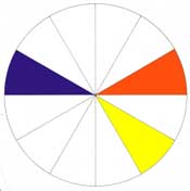
An example of a split complementary color scheme using blue-violet as the main color and yellow and orange.
A Tropical Color Scheme Using a Split Complementary Color Combination
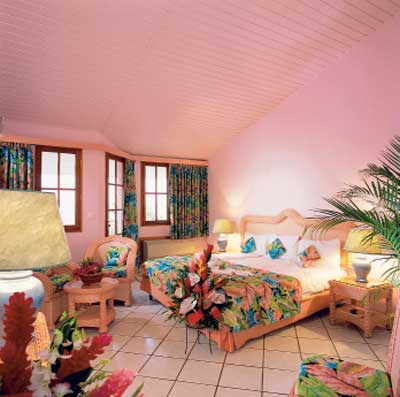
This Tropical or Caribbean color scheme is created using the split complementary color combination of red, blue and green. As we see those hues have been altered with the use of neutrals, to create pink, teal blue and jade green.The pink has been used as the dominant color, but as it is very pale the accent colors of teal blue and jade green in the fabrics create the focal point to the room.
Successfully Combining Patterns and Split Complementary Color Schemes
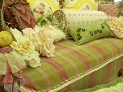
Here we have a split complementary color combination example using patterns and texture to great effect. Red-violet is the key color, and the split complementary colors are green and yellow. As you can see here the true hues from the color wheel are no longer, the colors or hues are now muted and combined in patterns, textures and stripes to create a casual yet luxurious look.
Contemporary Bedroom Color Scheme Fun with Florals and Polka Dots
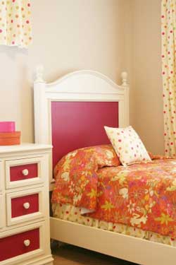
This modern bedroom has used the split complementary color scheme to create a fun interior color scheme. The use of green, red-violet, red-orange is vibrant and unexpected. The red-violet painted inserts on the furniture form a striking base to add the floral bedspread with the fabric incorporating the red-orange as the dominant color with accents of the red-violet and green. Then subtly, if you can call polka dots subtle, the curtains, bedding and decorative pillow are white with the three colors incorporated into the polka dots. This is a popular way of decorating young people’s bedrooms today as it is vibrant but not over powering, modern and fun.
A split complementary color scheme is a important color combination to learn as a beginner as it is a difficult color scheme to make a mistake with.
Find More Knowledge on Color
Free Color Course
Color Articles
Color Information
Color Meanings
Color Schemes
Color Theory
Paint