Choose Blue, the Color That Always Stays in Fashion and Remains a Trend in Interior Decorating
Choosing colors can be a nightmare for some of use, so I suggest you use blue, the safe color.
For some unknown reason blue, or variations of, seems to keep a place in interior design trends in one form or other.
I think that is because blue is such a versatile color.
The timeless color combination of Royal Blue and white, which was popularized with the influx of blue and white willow design china plates and crockery, is still as popular today as it was when it was introduced.
My personal favorite is blue and yellow. This color combination never fails to put a smile on my face and always creates a warm sunny beach or relaxing holiday home feeling. Recently I spotted this combination being used with a toile design in fabrics and printed wallpapers and it really does make a stunning focal point.
Combining blue and yellow, especially when it is a warm soft buttery yellow and a brilliant blue make a striking statement and are able to be used well in any room from the bathroom to the living room.
Children’s rooms can be made interesting and fun with cobalt blue and strong orange, they are bright and cheerful, and work well if you want to decorate before your baby arrives and don’t know the gender. There are numerous wallpapers and matching friezes that combine these colors, and the funky kids fabrics are endless. Blue and orange coordinate with the colors of toys and are colors that can grow with children, unlike pastel pink and baby blue.
A fantastic alternative to white in bathrooms is soft subtle blues which are basically white with a slight tint of blue. This color evokes a feeling of openness, calmness and crisp cleanliness to often a small space. It is easy to decorate with and accents of bold colors can be used to provide impact if required.
The use of dusky gray blues work well in reception areas or a home office as it creates somber feeling and combined with similar toned mauve adds warmth and depth creating a quiet peacefulness to the room.
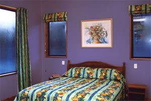
My bedroom was blue when I was a child, and using monochromatic blue schemes are one of the best option for these rooms. You simply work using different textures to add warmth and softness to the blue. This can be achieved with the introduction of wool or angora blankets adding softness, hand sewn patterned patchwork quilt adding pattern, smooth shimmery velvet curtains adding luster, the coarse and random look of flockati rugs adding homeliness, beaded lamp shades adding fun and texture as well as diffused light and you can just keep adding to a monochromatic scheme.
There is the standard, seen every day, red white and blue. A color combination on many country’s flag including my own. They are also standard corporate colors seen world wide, and are often integrated into the company uniform, branding and office interior color schemes. The combination also has a distinctive nautical theme, add a bit of brass and there you have it.
So to conclude, the safest color to use in decorating apart from white is blue. So if you are struggling to decide between two colors pick blue.
Find More Knowledge on Color
Popular Color Schemes
Free Color Course
Color Articles
Color Information
Color Meanings
Color Schemes
Color Theory
Paint