How to Choose a Color Scheme, Part One
Creating Color Schemes – Where to start?
Knowing where to start is the big hurdle that often stops people from giving it a go and choosing a color scheme for themselves.
It is important that you have read through the website and familiarized yourself with some color theory and delve into some color articles to get you thinking, then you will have a better understanding of the product we are about to create with.
Where to start when choosing a color scheme? This is a much-debated question.
The first thing that you need to do is to take a brief. This means sitting down with the client (or yourself) and writing down the expectations of the client, what style they like, what they would like to achieve, their budget, timeframe etc. All the parameters for the project.
Once you have this in place you can start.

Always check the positioning of the room in relation to the sun.
It is important when planning the scheme of a new house to look at the positioning on the site. Work out which rooms will have a lot of sunlight and which will not. If a room is on the cool side of the house use warmer colors, and vice versa.
So when starting with a blank slate, I would say start with the selection of the floor-covering product. This is due to the fact that it covers a large area, has distinctive tactile qualities, everyone will walk on it, and feel it and it will set the mood.
Carpet – soft and comforting, timber – warm and inviting, granite – cool and elegant, terracotta tiles – warm, rustic and casual.
From there, the next item would be your canvas – the walls.
Select one thing that will be constant throughout the entire scheme so that it will flow through the house.
For example the same paint color for all the doors and skirting boards. Visualize from the plans the spaces in 3 dimensions and work out what you will be able to see from each room, and then ensure the colors that you select are pleasing on the eye when viewed simultaneously.

If you want to define separate spaces, a change in floor finish works well. For example, solid timber floor in the kitchen area and dining room, (a large rug under the table and chairs will define that space as separate) moving onto carpet for the living area. Remember to consider all the elements of a room and not rely on one fantastic piece to express all.
Creating visual balance and harmony is the most important thing.
In general all other areas of selection are similar to those described in the renovation explanation to follow.
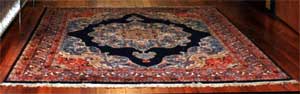
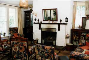
When renovating and redecorating existing spaces, it is not often possible to alter the flooring, so the best advice then is to choose something inspiring that you have to start your color scheme from. It could be an antique chest, a Chinese ceramic, a Turkish rug, a favorite chair or painting. Then use this item as your base to start selecting your color scheme.
It may sound daunting but as with any large task, if you break it down into small steps and successfully complete each – the whole task will come together.
The more frequently you practice these tasks, the easier it becomes until before you know it, you are achieving even bigger tasks.
Here is a methodical way of selecting color schemes, once you have taken the client brief.
(Client Brief: this is the client’s expectations or desired outcome. It is what they want to achieve, what they like and dislike, how they live and their family situation. It also encompasses a basic explanation of their existing items to be used and incorporated into the scheme.)
Remember to consider all the elements of a room and not rely on one fantastic piece to express all.
It is important to take into consideration all that you have learnt in the previous articles to form a cohesive scheme. It may sound daunting but as with any large task, if you break it down into small steps and successfully complete each – the whole task will come together.
The more frequently you practice these tasks, the easier it becomes until before you know it, you are achieving even bigger tasks.
Remember tone, balance and harmony for the space as well as your color wheel.
Think of which color / product / finish takes up the most space, try not to compete with this, but use it to build your scheme on.
Example 1 – Warm butter yellow walls, ceiling and carpet. You can use almost anything with this; we go to the color wheel to choose a scheme or use a monochromatic that lends to using texture and tone and makes the room calm soft and pleasing to the eye.
Example 2 – The same back drop but using color, cobalt sofa, primary color cushions, and paintings. This creates a more stimulating scheme than the previous.
Here is a methodical way of selecting color schemes, once you have taken the client brief.
1. Make a cup of coffee or tea and sit in the space that you are going to undertake the changes.
2. Look around and familiarize yourself with the existing surroundings and how they are currently used.
3. Take a pen and paper and note all the things that work in the room and all that do not – highlight any architectural features and note any eyesores that will need to be camouflaged. Review the natural and artificial lighting.
4. Take photographs of the room, (these are very useful for reference and also portfolio work later as “before and after shots”).
5. Make a list of all the items, areas, surfaces that there are. To simplify this start at the ceiling and work down. You will use this information to collate your scheme for the client and tradespeople to work from.
6. Type up the list to resemble as follows:
Item / Area |
Existing Substrate |
Existing Finish |
Existing Color |
| Entrance | |||
| Ceiling | Plasterboard | Enamel Paint | White |
| Cornice | Plaster | Paint | White |
| Walls – General | Plasterboard | Blue | |
| Dado Rail | Timber | Stained and Varnished | |
| Below Dado Rail | Timber | Stained and Varnished | |
| Skirting | Timber | Stained and Varnished | |
| Floor | Carpet (Timber Floor Boards Under) | Gray | |
| Features – Ceiling Rose | Plaster Painted | Yellow | |
| Pendant Light Fitting | Brass and Glass | ||
| Turkish Rug | Wool | Blue and Red Tones |
Continue with other rooms in a similar fashion.
How to Create a Color Scheme Part 2
Find More Knowledge on Color
Popular Color Schemes
Free Color Course
Color Articles
Color Information
Color Meanings
Color Schemes
Color Theory
Paint