Color and Nature
How nature plays a big part in choosing colors for our home interiors.
When was the last time that you actually took a good look at your surroundings when you are out for a walk?
Using the observation of color in nature to improve our design unleashes the creativity of a designer, simply start observing your surroundings. Take a stroll through the park, what do you see?
Trees, grass, water, ducks, leaves, flowers.
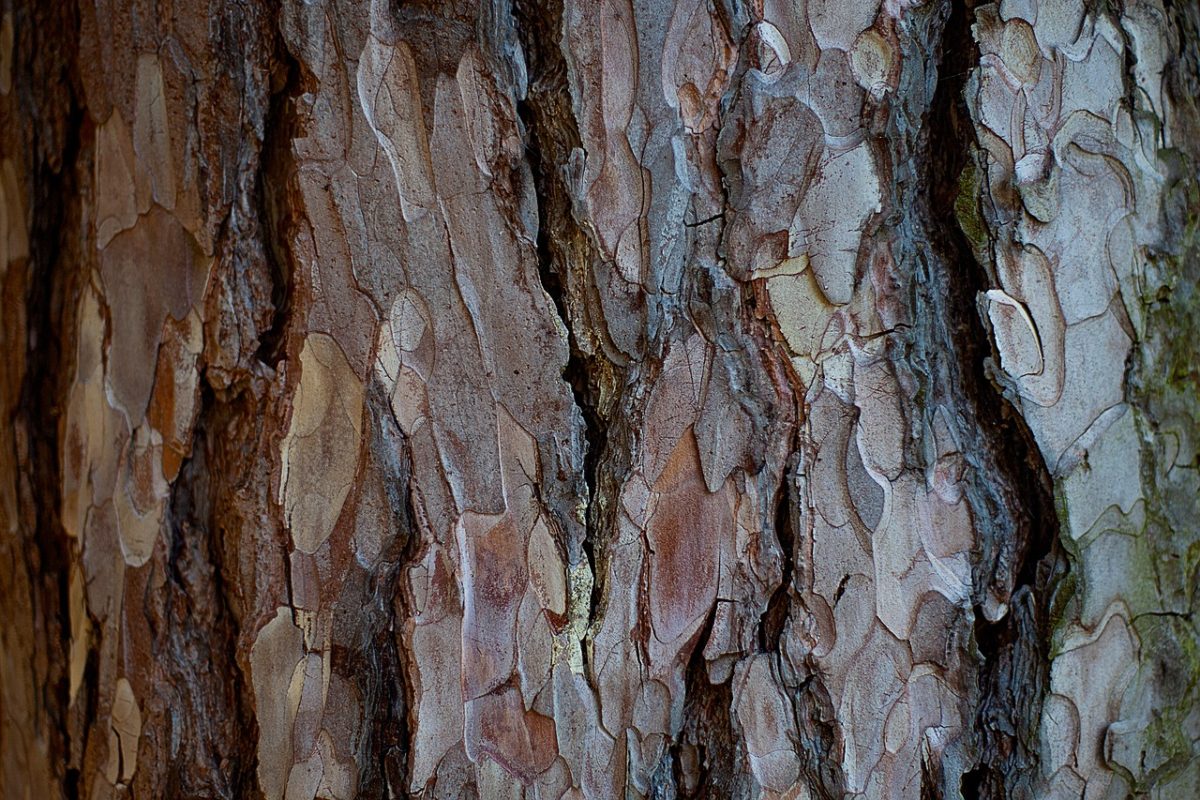
That is what everyone sees but look a little closer, look with a designer mind. Look at the way the bark covers the tree trunk, observe the myriad of colors within one small piece, retrace the form, feel the texture and see how it contrasts to the smoothness of the leaves.
Look how the sunlight can make the bark look different from when it is in the shade, observe the effect of shadow.
You can use these observations to learn how color, light and texture work in the interior. Another example is a flower, look closely, there is often more that one color in a single flower, and it frequently goes by unnoticed.
This simple use of juxtaposition means that the secondary color intensifies the main flower color.
Color and nature – they become all too familiar, you may perhaps note changes as the seasons alter, precious pink blossom in spring, bare brown naked branches in winter, crunching golden leaves in autumn, and luscious green grass in the summer, but apart from that we become blase.
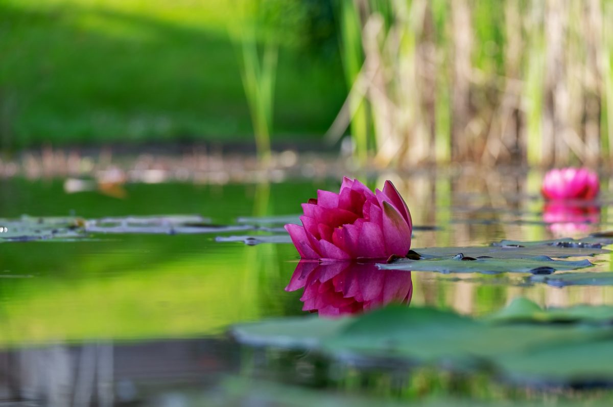
It will change the way you decorate if you actually take some time to stop and look in detail about how nature combines color, the juxtaposition of a vibrant yellow stamen in a brilliant red tulip intensifying each others color, the subtle monochromatic color changes of brown in the bark of a tree, the constant debate over the color of water in the lake, is it blue or green?
Colorful flowers float in a sea of green foliage, silver-grey stones and pebbles on the river bed shimmer to look metallic in the sunlight and like charcoal when they are wet. I could go on and on.
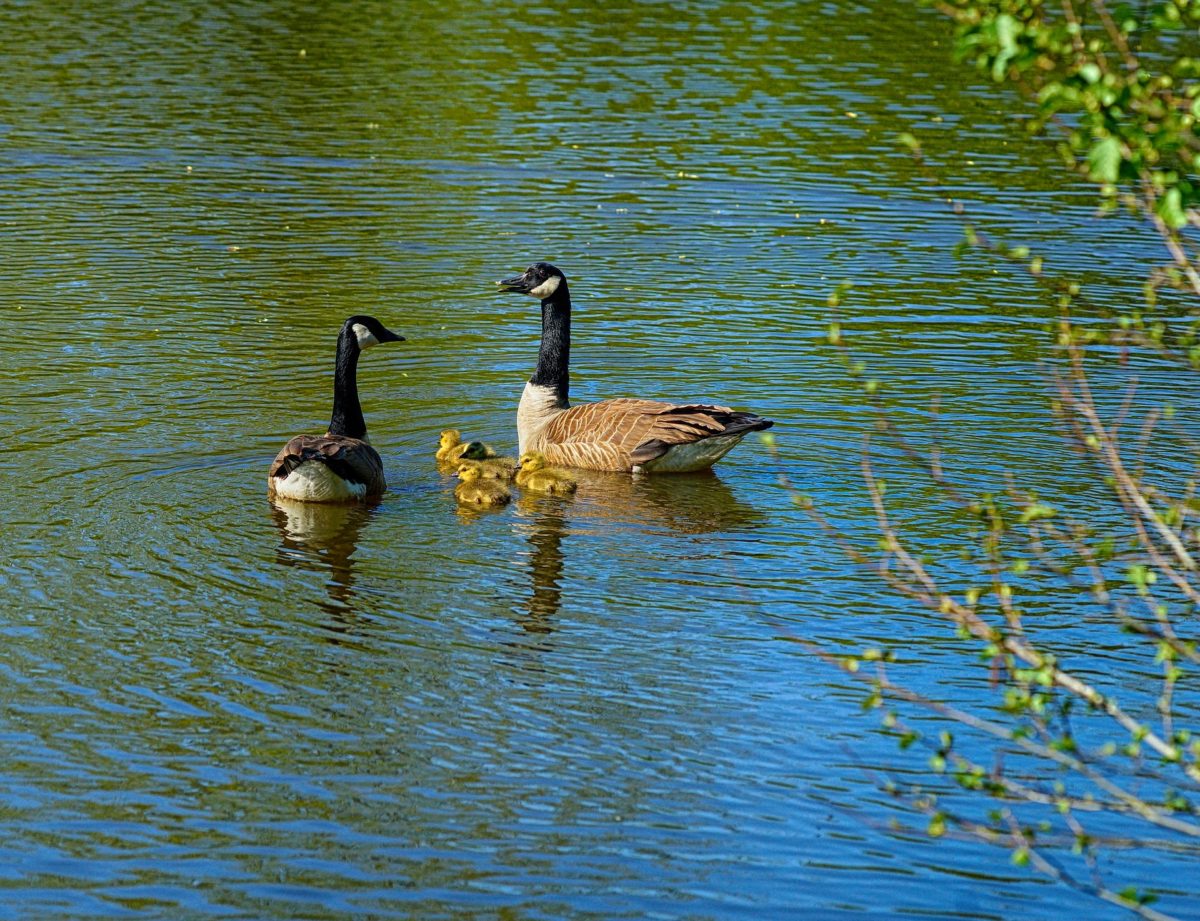
If you are looking for inspiration to create original and harmonious color schemes for interiors or exteriors for that matter, then it is as simple as taking a walk in the park to explore color and nature. Take a camera and snapshots that catch your eye, zoom in on insects on flowers, ducks on the water, birds in the tree, flowers, and shrubs. Then observe how the colors interact together to create a statement or just live together in harmony, providing a subtle backdrop for other more daring versions of nature.
Green, I define as a neutral color, you may say no, black white and grey are the neutrals, yes they are in a scientific way, but in nature, green is most definitely the most versatile neutral color, it sits well with every color. When I say green, you are probably thinking grass green, that is one version, but green can be as deep and vibrant as lime or as subtle as a silver-green lichen. Try experimenting with some color swatches, use greens as your base and add accents and see what sort of combinations you can come up with. It is good fun and a way to try out new ideas. You can try doing this with brown too, it is surprising how versatile this color can also be.
Another example – a pond of water, the shadows created by the clouds in the sky, the different depths of water, and once again the juxtaposition of other items in the pond combine to create a fantastic monochromatic scheme of blue/green.
We need to slow down our hectic pace and deadlines that drive us to create without thinking and take the time to appreciate what is around us, this acts as our catalyst to design. How many times have you had a mental block and no matter which way you look, there seems no solution? Many! A simple stroll in the park can be all that is required to clear you head, get the blood moving around the body and gives you time to observe where design begins, at nature.
How do you use this?
Nature plays a big part in choosing colors and products for our home interiors.
You have now had a good look around you at color, now try thinking about the combinations of texture and pattern and how they are affected when you put combinations together.
Examine the different textures of similar items and see how they can create a subtle design, or how the light can highlight or obscure texture, how much of a different color do you need to make a statement, see how a mass of wildflowers with hundreds of different colors can work together to form a subtle single entity, how the curved flowing lines of a Willow tree are softer than the brutal severe lines of a Pine tree.
These are probably things that you have never taken the time to observe, but they are very relevant to how we create good design of new product and create comfortable interiors. Then look even closer, look now with a designer’s mind.
Observe the way the bark wraps the tree trunk, see the myriad of colors within one small piece, retrace the form, feel the texture and see how it contrasts to the smoothness of the leaves.
Look how the sunlight can make the bark look different from when it is in the shade, compare it to the effect of shadow on the tree. Try this with other aspects of nature, keep notes and photographs and you will be surprised how often you draw down on this information as inspiration for choosing colors, textures and patterns to create harmonious schemes and ideas.
Think of yourself as a scientist who has been conducting an experiment with color, texture, and pattern; in order to make any progress you need to observe, then analyze your findings, then you will be able to relate them back to your work, and how they can work in with people; after all people are the main reason for design, to create environments in which we can perform specific tasks comfortably. For example, a chair looks and feels more comfortable when soft curves are used, similar to those of the tulip chair, womb chair or egg chair.
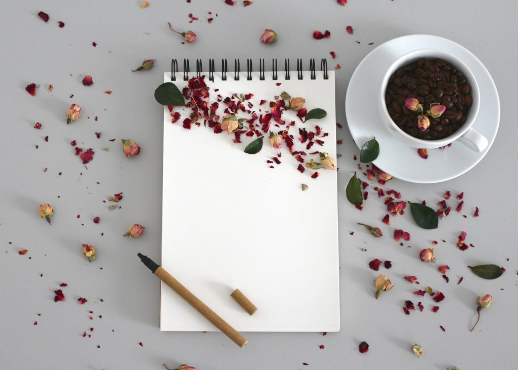
Carry around a notebook and jot down your observations, what colors look great together, how the different textures of similar items create a subtle design, how the light can highlight or obscure, how much of a different color do you need to make a statement, how a mass of wildflowers with hundreds of different colors can work together to form a subtle single entity.
With these observations think how you would relate them back to your work, and how they can work in with people; after all, we are the main reason for design, to create environments in which we can perform specific tasks comfortably.
To conclude, like anything in life whether you are a scientist conducting an experiment, a doctor assessing a patient, a baker surveying his dough, you must observe to achieve your desired result. So start now!
Next time you see a new product in a magazine, think back to your observations and see if you can see how it is related to nature.
Find More Knowledge on Color
Popular Color Schemes
Free Color Course
Color Articles
Color Information
Color Meanings
Color Schemes
Color Theory
Paint
If you want to learn about Color for Interiors why not register for your free Color Course. This will guide you through the topics we cover in color for interiors. The great advantage is, it is emailed to you and you then use this website as your learning resource. We have been providing courses online for over 16 years now. Join many of the other happy readers who have changed the way they now look at interior design. Please take a moment and enroll in our free color course.
If you already have some knowledge of color or have already completed interiordezine.com’s Color Course, then you can take yourself to the next learning level. Visit WillowCollege.com, new courses are now available which provide you with everything you need to know about color for interior design and more. Have fun!
There are 4 courses available